


 Рейтинг: 4.7/5.0 (1842 проголосовавших)
Категория: Windows: Редакторы
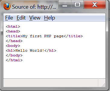
HTML довольно простой язык, его учат все студенты технических и гуманитарных специальностей в вузах, а настоящий момент думаю его изучают и в большинстве школ. Все довольно просто, потому что HTML это даже не язык программирования.
HTML - это язык разметки, что мы пишем, то и выводится на экран. Никаких алгоритмов, схем, циклов, переменных, классов, а просто текст, текст, текст. В HTML будут только теги, да и тех на самом деле не очень много, а тех которые часто используются вряд ли наберется и 3 десятка. Так что если вы решили заняться языком смежным с языками программирования, то HTML - это правильный выбор.
Чтобы начать создавать документы в формате HTML нам понадобится программа блокнот (он уже входит в состав систем windows, linux) и браузер, чтобы этот документ просматривать (Firefox, Opera, Chrome или Internet Explorer). В качестве текстового редактора (блокнота) под ОС Windows я использую notepad++.
Я считаю, что пара строк выше должна была подготовить к обучению, а больше ничего нам и не нужно, поэтому приступим.
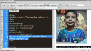
Мой первый документ HTMLДокументы HTML - это обычные текстовые файлы, такие как файлы readme.txt и прочие файлы с раширением .txt
Что такое расширение?
Файловые расширения - привилегия преимущественно операционных систем с графическим интерфейсом. Основное предназначение их - указать операционной системе, какую программу следует вызвать для открытия определенного файла. Не будем говорить о всевозможных расширениях, указывающих на исполняемые файлы, так как командный интерпретатор операционной системы - тоже своего рода программа, которая работает с файлами, имеющими маску, например. COM; .EXE; .BAT; .CMD; .VBS.
Для HTML документов мы будем использовать расширения .HTML. HTM
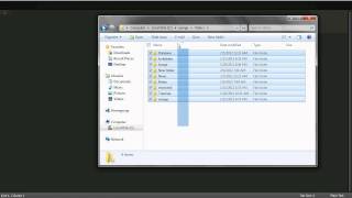
Пришло время создавать документ. Заходим в нужную нам папку и кликаем правой кнопкой мыши в свободном месте:
Выбираем создание текстового документа. Файл назовем index.html, можно также использовать расширение .htm.
Возможно, что настройки вашей системы не позволят задать расширение и вас сохранится файл index.txt. Тогда нужно:
Теперь когда файл index.html создан, открываем его через блокнот и начинаем создавать HTML-разметку.
HTML разметка создается с помощью тегов. Теги имеют следующий вид
Сначала идет первая тега, он называется открывающим, это слово заключенное в знаки меньше и больше. Знаки меньше и больше не произносятся и мы говорим "это тег tag".
Начнем с самого простого тега <html></html>. Это самый главный тег с него начинается html документ и этим же тегом html документ заканчивается:
Писать теги можно и в строчку, но удобнее когда теги располагаются друг под другом на одной вертикальной линии, в этом случае notepad++ подсвечивает теги.
Дальше внутри тега <html> мы будем располагать тег <body></body>. Body это тело нашего документа в буквальном смысле. Все что мы видем в браузере находится внутри тега body. Совсем забыл про браузер. Давайте изменим содержимое файла index.html и сохраним файл.
Посмотрите как я расположил тег body, он отступает на два пробела от вертикальной линии тега html. Такое расположение увеличивает читаемость HTML-документа. Итак сохраняем документ и открываем его через браузер.
У нас должно появится пустой экран. И это правильно, потому что мы еще никакого текста не добавили в документ.
Давайте же добавим текст, прямо между тегом body.
Сохраните документ и обновите страницу в браузере. Теперь текст HTML мои первые шаги появится. И все потому что мы разместили его в теге body, ни выше тега body, ни ниже тега body, а именно внутри тега.
Вы наверно заметили что у меня только надпись Mozilla Firefox в заголовке документа, то есть у нас документ без заголовка. Давайте исправим безликий HTML-документ и добавим заголовок.
Заголовки мы будем добавлять внутри еще одного тега <head></head>. Тег <head> располагается выше тега body:
Если вы сейчас сохраните документ и обновите страницу в браузере, то ничего не измениться, в теге head необходимо прописать тег <title></title>, который отвечает за заголовок:
Сохраняем файл, обновляем страницу в браузере и вуаля, у нашего документа появился заголовок.
Думаю для вводного урока этого достаточно, в следующих уроках мы разберем еще многое.


Your browser may not support the functionality in this article.
IntroductionWe're going to walk through how to create an adaptive web experience that's designed mobile-first. This article and demo will go over the following:
There is even more up to date responsive guidance on our new Web Fundamentals site.
As the web landscape becomes increasingly complex, it's becoming extremely important to deliver solid web experiences to a growing number of contexts. Thankfully, responsive web design gives web creators some tools for making layouts that respond to any screen size. We'll use fluid grids, flexible images and media queries to get the layout looking great regardless of the size of the device's screen dimensions.
However, mobile context is much more than just screen size. Our mobile devices are with us wherever we go, unlocking entire new use cases. Because we constantly have our mobile devices with us, connectivity can be all over the board, ranging from strong wi-fi signals on the couch to 3G or EDGE when out and about. In addition, touch screens open new opportunities to interact directly with content and mobile ergonomics lead to different considerations when designing layout and functionality.
In order to create a site that's truly designed for mobile context and not just for small screens, we want to ensure that we tackle the many challenges of mobile development upfront. The constraints of the mobile context force us to focus on what content is essential and how to present that content as quickly as possible. Building fast-loading, optimized experiences mobile first has a trickle down (or up, depending on how you look at it) effect for tablet, desktop and other emerging contexts.
What We're Making: The Humble Product Detail PageThe demo we're making is a simple e-commerce product detail page for a fictitious t-shirt company. Why choose this? E-commerce sites can have many use cases across contexts. For example, 70% of smartphone owners use their mobile phones to influence in-store purchases. So while we'll make sure that purchasing the product is as easy as possible, we'll also try to make the product reviews accessible and utilize the user's location to enhance the mobile experience.
Authoring lean, semantic HTML5 markup keeps adaptive experiences manageable and accessible, and also provides opportunities for enhanced experiences (quick example: using proper HTML5 input types brings up the appropriate virtual keyboard on many touch devices). Semantic markup is extremely portable and can be accessed by many mobile devices, tablets, desktop browsers and future web-enabled devices, regardless of feature set or capability.
Setting the viewportIn order to accommodate for sites not optimized for mobile screens, many modern mobile browsers set a larger browser viewport, which allows for better viewing of non-mobile-optimized sites. Users can then pinch-to-zoom in on the content they want. That's fine for non-mobile experiences, but because we're optimizing our experience for mobile browsers, we'll use the viewport meta tag to set the screen width to the device width:
It's important to note that we're not disabling the user's ability to zoom the page (which you could do by adding user-scalable=no to the content attribute), even though we're optimizing the content for small screens. It's recommended to keep user zooming enabled to keep things as accessible as possible. However, there are use cases to disable user-zooming, such as if you're including fixed positioned elements .
Content fragmentsIn order to keep the experience as lightweight as possible and to improve the perceived loading time, we're creating two additional HTML documents for our auxiliary content, reviews.html andrelated.html. Because this content isn't required for the main use case (buying the product) and includes a number of images, we won't load it by default to keep the initial page size down. By default the content is accessible via links on the page, but if a certain level of javascript support is present, we'll conditionally load the content when the user requests it or when the resolution reaches a certain breakpoint.
HTML Special CharactersA simple technique to reduce the need for background images (thereby saving HTTP requests) is to use HTML special characters for simple shapes. In the case of our rating stars, we're using ★ to create a solid star (★) and ☆ to create empty stars (☆) for our ratings. And because it's HTML and not an image, it stays crisp even on high resolution screens.
The tel: URI SchemeAnother simple yet effective technique we're including in our footer is a clickable link to the customer service number. This is accomplished by using the tel URI scheme, which looks like this:
We sometimes forget that mobile devices can make phone calls. and also that some desktop configurations can launch VoIP applications to initiate a phone call. We're including an easy way for users to facilitate a phone call, which in some cases might make sense (i.e. a mobile user who might prefer finishing the transaction over the phone versus going through a checkout flow on their mobile device).
Now that we have a strong, semantic foundation in place, let's move onto adding style enhancements.
When crafting our CSS, we'll do everything in our power to keep things lightweight and as fluid as possible. We understand that all these devices have many different screen sizes, and that tomorrow's devices won't have the same resolutions as today's. Because screen size is an unknown, we'll use the content itself to determine how the layout should adjust to its container.
Separate style sheet for larger screensWe're creating two separate CSS files, style.css and enhanced.css in order to deliver basic styles for screens less than 40.5em and using media queries to serve up enhanced styles for screens larger than 40.5em.
We're using the conditional code <!--[if (lt IE 9)&(!IEMobile)]> in order to serve up enhanced.css to non-mobile versions of IE less than version 9, which unfortunately don't support media queries. While this method does indeed add an HTTP request to the mix, it gives us greater flexibility over our styles. Alternately, we could use respond.js to deliver enhanced styles to IE.
We're using the em unit instead of px to maintain consistency with the rest of our relative units and account for user settings like zoom level. Also, the content should determine the breakpoint (we're using 40.5em as a breakpoint) because device dimensions are too varied and are always changing so are therefore unreliable .
Mobile-First StylesStarting with baseline shared styles and introducing more advanced layout rules when screen size permits keeps code simpler, smaller and more maintainable. Here's just a quick example to demonstrate this point:
We want to avoid complexity as much as we can, so here's what a mobile-first approach looks like:
Instead of declaring large screen rules first only to override them for smaller screens, we'll simply define rules as more real estate becomes available. The web by default is a fluid thing so we'll do our best to work with it instead of against it. It's important to note that some mobile browsers (Symbian browsers, Blackberry <OS 6.0, Netfront, WP7 pre-Mango, etc) don't support media queries, so serving base styles by default reaches more devices and browsers. As Bryan Rieger puts it. "the absence of support for @media queries is in fact the first @media query."
Applying Media QueriesWe're continuing our mobile-first style when we apply our media queries. Our related product list starts off two to a row, but increases to 3 in a row when the screen size is at least 28.75em wide (roughly the size of mobile phones in landscape mode) and then to 6 to a row when the screen size is at least 40.5em (roughly tablets in portrait mode or small desktop screens).
Assuming small screen by default allows us to support more platforms and also makes it easy add more breakpoints without having to modify existing styles. Defining styles as they're needed also keeps file size down, reduces complexity and keeps code more maintainable.
Using Relative UnitsWe're using percentages and em units in our design in order to keep things as flexible as possible. Relative units are far more compatible with the tremendous variance brought on by screen size, pixel density and zoom level.
While media queries are responsive web design's secret sauce, we want our fluid grids to do most of the work. Maintaining a whole slew of set-width styles across many media queries can become unwieldy, so we'll make sure the stylesheet's foundation is entirely flexible. Ethan Marcotte provides a formula for converting dimensions and font sizes from pixel-based to relative units:
Using CSS to Reduce RequestsToo many HTTP requests can be a huge killer for performance. especially on mobile. We're incorporating some CSS techniques to save HTTP requests which will improve the site's performance. Using CSS gradients instead of background images reduces the amount of image requests and gives us more control over the design. We're including the appropriate vendor prefixes to ensure maximum compatibility (there are tools for this) and hoping that one day that these rules will become standardized to save us some time.
We're also using data URIs instead of background images for some of the smaller icons (for icons like search, social features and location). While data URIs might look a bit ugly and can increase up the stylesheet file size, the reduction of requests results in a faster perceived download time .
Now that we have our structure and style in place, we'll add JavaScript enhancements to add functionality to the navigation, image gallery and auxiliary content.
NavigationNavigation can be especially tricky for adaptive experiences. Top navigation is common for desktop sites, but top navigation can crowd the screen and push down the primary content on small screens. We want to highlight the product and not the site navigation, so we'll do our best to get the navigation out of the way. in our markup we've created a list called #nav-anchors, which will be used to toggle the visibility of the navigation and search bar for small screens.
We'll add a resize listener which will determine whether there's enough room to show the navigation and search bar.
Image GalleryBy default the image gallery is simply a large image with thumbnail images that click through to their larger counterparts. This means that they're accessible to browsers and devices with poor or no JavaScript support.
We'll build an image carousel from the available thumbnail images:
To enhance the experience further, we're using Modernizr to detect for the presence of touch events and CSS transitions, and if they are supported, we'll load in a library called SwipeJS to make a touch-friendly image carousel.
We now have an accessible image gallery with added enhancements for touch-enabled devices.
Related ContentIn order to keep Initial page size down, we're not loading auxiliary content, namely the related t-shirts and product reviews, by default. Instead, they exist as their own HTML pages, which are accessed by links as a default behavior.
We'll pull in the related content when one of two conditions are met: When a small-screen user clicks the related shirts or product reviews links When the screen has enough room to load in the auxiliary content.
note: we're using screen size to determine when to load in content, but this is in no way perfect. Keep an eye out for navigator.connection for a better way to determine whether it's worth introducing extra content.
GeolocationLeveraging user location to deliver enhanced experiences is an important aspect of mobile development. Thankfully geolocation is one of the best supported Features across mobile browsers (as well as most desktop browsers). The fallback functionality could be a simple form where the user simply inputs their ZIP code to find store near them.
Next Steps Adaptive ImagesOur demo isn't incorporating many large images, but it's best practice to load in mobile optimized images by default then conditionally load in larger images only when needed. There are lots of different techniques for responsive images. both client-side and server side. We've done a lot so far to be mindful of performance, and optimizing images is an easy way to optimize performance even further.
Keeping pages as lightweight as possible is important for performance, so we should look to optimize scripts as much as possible. We're using the jQuery library for our demo, but we're definitely not using all of it. We could look into using Closure Compiler to strip out unused bits of the library to keep things as lightweight as possible while still taking advantage of what jQuery offers. Alternately, we could look into micro-frameworks like Zepto.js and others, but they typically don't necessarily offer the best cross-browser support. Writing vanilla Javascript could avoid additional heft but can be more difficult to author and harder to maintain. Ultimately, each approach has its pros and cons, just be sure to consider the tradeoffs when making these decisions.
Offline AccessIt's increasingly important to make sure web experiences are accessible offline, especially when considering mobile users with variable connectivity. Thankfully, appcache and other offline techniques gives us a way to keep our resources accessible even when the user is offline.
Wrapping UpWe've created an experience that is mindful to user context and adapts both layout and functionality based the browser and device's features. We've also set up a foundation that can adapt to future devices and browsers. Here's some key takeaways:
Creating adaptive experiences allows your content to go more places, which means more opportunities to reach potential customers wherever they may be. By adhering to the principles of progressive enhancement and addressing constraints first, we're laying a future-friendly foundation that gives our site a better chance of working in future browsers and environments.
После полученных в предыдущем уроке знаний вы уже через несколько минут создадите свой первый web-сайт.
В Уроке 1 мы узнали, что необходимо для создания web-сайта: браузер и Notepad (или аналогичная программа - текстовый редактор). Поскольку вы читаете этот текст, то ваш браузер уже открыт. Вам нужно открыть лишь дополнительное окно браузера (открыть браузер ещё раз), и вы сможете читать этот учебник и одновременно видеть ваш новый web-сайт.
Также откройте Notepad (в Accessories в Programs - Start menu):
Теперь мы готовы!
Что я могу?Начнём с чего-нибудь попроще. Как насчёт страницы, на которой написано: "Ура! Это моя первая web-страница." Читайте дальше, и вы узнаете, как это легко сделать.
HTML прост и логичен. Браузер читает HTML так, как читаете его вы: сверху вниз и слева направо. Таким образом, HTML-документ начинается и заканчивается тем, чем должен начинаться и заканчиваться текст.
Во-первых необходимо сообщить браузеру, что вы будете "говорить" с ним на языке HTML. Это делается тэгом <html> (тут ничего нового). Так что, прежде чем напечатать что-либо, нужно поставить тэг " <html> " в первой строке документа Notepad.
Как вы, возможно, помните из предыдущего урока, <html> это открывающий тэг, который должен иметь и закрывающий тэг после того, как вы закончите ввод HTML. Поэтому, чтобы не забыть, поставьте закрывающий тэг " </html> " на пару строк ниже и вводите весь текст документа между <html> и </html> .
Следующее, что необходимо, это "head" (голова или "шапка"), которая содержит служебную информацию о вашем документе, и "body" (тело), содержимое самого документа. Поскольку HTML логичен, head ( <head> и </head> ) находятся выше body ( <body> и </body> ).
Ваш документ теперь должен выглядеть так:
Обратите внимание, как мы структурировали тэги по строкам (с помощью клавиши Enter) и какие сделали отступы (клавишей Tab). В принципе не важно, как вы структурируете ваш HTML-документ. Но, для облегчения чтения кода, настоятельно рекомендуем структурировать ваш HTML с помощью перевода строк и отступов. как в нашем примере.
Вот вы уже и сделали вашу первую web-страницу - первенца, который, возможно, выглядит не так, как вы предполагали, когда начинали читать этот учебник, но это уже, в некотором роде, web-сайт. Вы создали базовый шаблон для всех последующих HTML-документ.
Ну ладно, но как мне добавить содержимое в мой web-сайт?Как вы уже видели ранее, в вашем HTML-документе есть две части: а head и body. В разделе head вы вносите информацию о странице, а body содержит информацию самой страницы .
Например, если вы хотите дать название документу, чтобы оно появлялось в верхней строке браузера, это нужно сделать в разделе "head". Тэг для названия - <title> :
Обратите внимание, что этот title не появляется на самой web-странице. Всё, что вы хотите видеть на самой странице, является содержимым/content и должно, следовательно, находиться между тэгами "body".
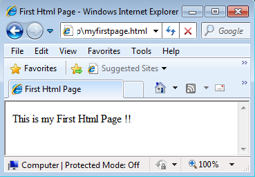
Итак, мы хотим, чтобы на странице выводилось "Ура! Это моя первая страница." Этот текст, который вы хотите показать, и, естественно, он должен располагаться в разделе body. Поэтому в разделе body напечатайте следующее:
Буква p в <p> это сокращение от "paragraph" и означает именно это - параграф текста.
Ваш HTML-документ должен теперь иметь такой вид:
Готово! Вы создали свой первый настоящий web-сайт!
Теперь нужно сохранить его на жёсткий диск, а затем открыть в вашем браузере:
Теперь откроем браузер:
Теперь вы должны увидеть страницу с текстом "Ура! Это моя первая страница." в вашем браузере. Поздравляем!
Если вы хотите, чтобы весь мир увидел ваше творение, можете перейти в Урок 14 и вы узнаете, как выгрузить вашу страницу в Internet. Или наберитесь терпения и читайте дальше. Всё ещё только начинается.
Псевдокласс :nth-child используется для добавления стиля к элементам на основе нумерации в дереве элементов.
элемент:nth-child(odd | even | <число> | <выражение>) <. >
odd Все нечетные номера элементов. even Все четные номера элементов. число Порядковый номер дочернего элемента относительно своего родителя. Нумерация начинается с 1, это будет первый элемент в списке. выражение Задается в виде an+b. где a и b целые числа, а n — счетчик, который автоматически принимает значение 0, 1, 2.
Если a равно нулю, то оно не пишется и запись сокращается до b. Если b равно нулю, то оно также не указывается и выражение записывается в форме an. a и b могут быть отрицательными числами, в этом случае знак плюс меняется на минус, например: 5n-1.
За счет использования отрицательных значений a и b некоторые результаты могут также получиться отрицательными или равными нулю. Однако на элементы оказывают влияние только положительные значения из-за того, что нумерация элементов начинается с 1.
В табл. 1 приведены некоторые возможные выражения и ключевые слова, а также указано, какие номера элементов будут задействованы.
Табл. 1. Результат для различных значений псевдокласса
So we’re set? You have your text-editor at the ready (preferably NotePad or TextEdit), you know what all the acronyms stand for, and you want to write something? Great, let’s get going.
Let’s just go through the steps involved before I actually introduce the code. Today,
All pages follow this basic structure. Let’s start with the first tags you’re going to learn.
Yeah. They are the things between the <> brackets. I’m sure you’ve seen them in someone’s code before, but if you haven’t, right-click this page and select “V iew Source”. The code that makes this page will appear. Have a quick glance through it. Yes, it probably makes little sense yet, but that doesn’t matter at the moment. See how, later on, there’s some text? It’s the words you’re reading now. Surrounding all that is a load of stuff, all being encased by <>s. That’s all the HTML that goes into making this page.
Structure of HTML ElementsTags follow a common structure too. Some of those tags you can see are ”start tags”, like <b>. and others are paired with them and called “end tags”. They look like </b>. Together, a start tag and an end tag form a HTML element. A start tag opens an element and an end tag closes it again.
For example, to make text bold. you use the b element. So, at the point in your text that you want the bold to start, you just stick the angle-brackets around that and put <b>. and when you want it to stop, you put </b>. An end tag is simply the start tag with a forward slash in front of the element name. Some tags won’t need that end tag, but most do, so don’t forget it.
So let’s make a pageOh yeah. Ok, first step. Open Notepad. or any other text editor. Type this:
<html>
</html>
These are the standard start and end tags on any page. Note that when I say “standard”, that means “you must put it there”. HTML elements can contain text and other HTML elements inside them, and these two tags will contain the rest of the HTML that makes your page.
Now we’ll add in the rest of the structure. Modify your page to this:
Very Important <!DOCTYPE HTML PUBLIC "-//W3C//DTD HTML 4.01 Transitional//EN" "http://www.w3.org/TR/html4/loose.dtd">
<html>
<head>
<title>My First HTML Page</title>
</head>
<body>
My text goes here.
</body>
That complicated looking bit at the top isn’t something you need to worry about just yet. It basically tells your browser which version of HTML you’re using in your page. You are going to be using HTML 4.01. the most recent version of HTML. Later you may move to a newer version, but HTML 4.01 will be perfect for most of your sites.
HTML pages are made up of two distinct parts — the head part, and the body part. The head part contains things that won’t appear on your page. Most of the elements that go in the head part are advanced stuff for search engines and the like, so the only one you need to know for now is title .
The text you put into the title element is the text that appears at the very top of your browser window when you view the page. You can type whatever you want in that. No other HTML will work in here, although special characters will. Don’t forget to add the title. because without it, that bar will have the URL of your page in it, and that’s just nasty. This text will also be used if a reader bookmarks your page, and in search engine listings, so take the time to write a unique title for each page.
The body section is the main part of your page. Everything between those two tags will be visible on your page. So type something there now. Whatever you want, I don’t care. Be spontaneous.
Now your page looks something like this:
<!DOCTYPE HTML PUBLIC "-//W3C//DTD HTML 4.01 Transitional//EN" "http://www.w3.org/TR/html4/loose.dtd">
<html>
<head>
<title>My first HTML page</title>
</head>
<body>
<b>Hello!</b>
I hope you’re having as much fun reading this as I had writing it!
</body>
</html>
That’s about as complicated as I’m going to make this tutorial. If you want to format your text, check the next page where you will find all the tags needed to make your page more presentable. For now, stick with saving your page and checking how it looks.
Saving your masterpieceNow that you have your first page written, you need to save it to your computer’s hard disk, and then open it up in a different program (your web browser). This part can be a little tricky, so please follow along closely.
When you double-click a file on your computer’s desktop, the computer knows what program to open the file in by checking the file’s “extension”. This is the characters that come after the name of the file. So, for example. mp3 files will open in a program that can play music, and .txt files will open in a text editor.
You need to give your document a file extension of ”.html”, which will tell it to open the file in your web browser, such as Internet Explorer, Firefox or Safari (at least one of these programs will have come with your computer — in fact, you’re reading this in one of them right now!).
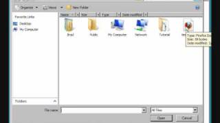
Right now you should be editing your HTML page in a text editor, which normally saves files with the extension “.txt”. We want to make it save in “.html” instead, so, in your text editor click File > Save As…. Find the place on your hard drive where you want to keep all your pages (I would recommend you create a new folder on your desktop and keep all of your documents together). If you use Microsoft Windows, there will be a box labelled “save as type”; change it to “all files *.*”. This means that you can save the data (in this case, some text) into any format. Now type in the name index.html for your file and click save. Finito.
sourcetip: After you have done this once, the next time you change your code, you will only need to press Save. not Save As…. because the computer now knows this is a HTML file.
Your page’s filename can consist of any combination of letters, numbers or _ (underscore) and - (hyphen) characters. It is a good practice to start the filename with a letter and use lowercase letters at all times. This will make sure that you won’t get any capitalisation errors when people try to type your page’s address into their web browser. You should always call your homepage index.html — this will be important later on.
Question: how come I sometimes see some pages named “something.htm” ?
Well, a long time ago back in the 1990s, file extensions were limited to only three letters, hence “.htm”. You could name all your files using .htm as the suffix, but there are so few people with operating systems that old that you’re better off just using .html and being done with it.
Note to users of word processors
If you’re trying to use something like Microsoft Word to make your pages (which is a really bad idea), you don’t want to be saving all of the editor’s values for margins and formatting etc. when you save your html file, as they can’t be read by your browser. So when saving your file, make sure to save it as text-only. and only the things useful to your browser will get saved.
Again, I implore you all to use just a simple text editor while you are learning HTML. It will mean that much fewer things can go wrong, and you will learn so much quicker!
Having a lookWell, you’ve been toiling away on this page for hours, has it paid off? Let’s check. Create a new web browser window to open it in (so that you can keep this page open when you do it) — press Ctrl + N. Now, in that new one that should have opened, go to File > Open. Click Browse… and find the file you just saved (“index.html”, unless you were cheeky and called it something else). Click the Open button. Your page will appear in all it’s glory. You did it! Huzzah!
Ok, now smile. O
In the next tutorial, you will learn about more of the options you have to format your text .
HTML has been on a wild ride. Sure, HTML started as a mere markup language, but more recently HTML's put on some major muscle. Now we've got a language tuned for building web applications with Web storage, 2D drawing, offline support, sockets and threads, and more. And to speak this language you've got to go beyond HTML5 markup and into the world of the DOM, events, and JavaScript APIs.
Now you probably already know all about HTML markup (otherwise known as structure) and you know all about CSS style (presentation), but what you've been missing is JavaScript (behavior). If all you know about are structure and presentation, you can create some great looking pages, but they're still just pages. When you add behavior with JavaScript, you can create an interactive experience; even better, you can create full blown web applications.
Head First HTML5 Programming is your ultimate tour guide to creating web applications with HTML5 and JavaScript, and we give you everything you need to know to build them, including: how to add interactivity to your pages, how to communicate with the world of Web services, and how to use the great new APIs being developed for HTML5.
Here are just some of the things you'll learn in Head First HTML5 Programing:What you should know before reading this book
This is a learning experience, not a reference book. We deliberately stripped out everything that might get in the way of learning whatever it is we're working on at that point in the book. And the first time through, you need to begin at the beginning, because the book makes assumptions about what you've already seen and learned.
We expect you to know HTML and CSS.If you don't know HTML markup (that is, all about HTML documents including elements, attributes, property structure, structure versus presentation), then pick up a copy of Head First HTML with CSS & XHTML before starting this book. Otherwise, you should be good to go.
Some experience helps, but we don't expect you to know JavaScript. If you've got any programming or scripting in your background (even if it isn't JavaScript), it's going to help you. But, we don't expect you to know JavaScript going into this book; in fact, this book is designed to follow Head First HTML with CSS & XHTML. which has no scripting in it.
We encourage you to use more than one browser with this book.We encourage you to test the pages and web applications in this book with several browsers. This will give you experience in seeing the differences among browsers and in creating pages that work well in a variety of browsers. We most highly recommend Google Chrome and Apple Safari for use with this book as they are, in general, the most up-to-date with the current standards. But we do recommend you also try the most recent versions of the other major browsers including Internet Explorer, Firefox and Opera, as well as mobile browsers on devices with iOS and Android.
Software RequirementsTo write HTML5 and JavaScript code, you need a text editor, a browser, and, sometimes, a web server (it can be locally hosted on your personal desktop). The text editors we recommend for Windows are PSPad, TextPad or EditPlus (but you can use Notepad if you have to). The text editors we recommend for Mac are TextWrangler, TextMate or TextEdit. If you're on a Linux system, you've got plenty of text editors built-in, and we trust you don't need us to tell you about them.
We hope you've got the browser bit covered and have installed at least two browsers (see the previous page). If not, do it now. It's also worth your time to learn how to use the browser developer tools; each of the major browsers has built-in tools you can use to inspect the JavaScript console (you can see errors as well as output you display using console.log, a handy alternative to alert), web storage usage, the DOM, CSS style that's been applied to elements, and much much more. Some browsers even have plug-ins for additional developer tools.
You don't need the developer tools to get through the book, but if you're willing to spend the time to investigate how to use these, it will make development easier. Some HTML5 features and JavaScript APIs require that you serve files from a real web server rather than by loading a file (i.e. your URL will start with http:// rather than file:// ). We've identified which examples you'll need a server for in the appropriate places in the book, but if you're motivated, we recommend you go ahead and install a server on your computer now. For Mac and Linux, Apache comes built-in, so you'll just need to make sure you know how to access it and where to put your files so you can serve them using your local server. For Windows, you'll need to install Apache or IIS; if you go the Apache route, there are plenty of open source tools like WAMP and XAMPP that are fairly easy to install.
That's it! Have fun.
Book code and downloads